Grid and spacings
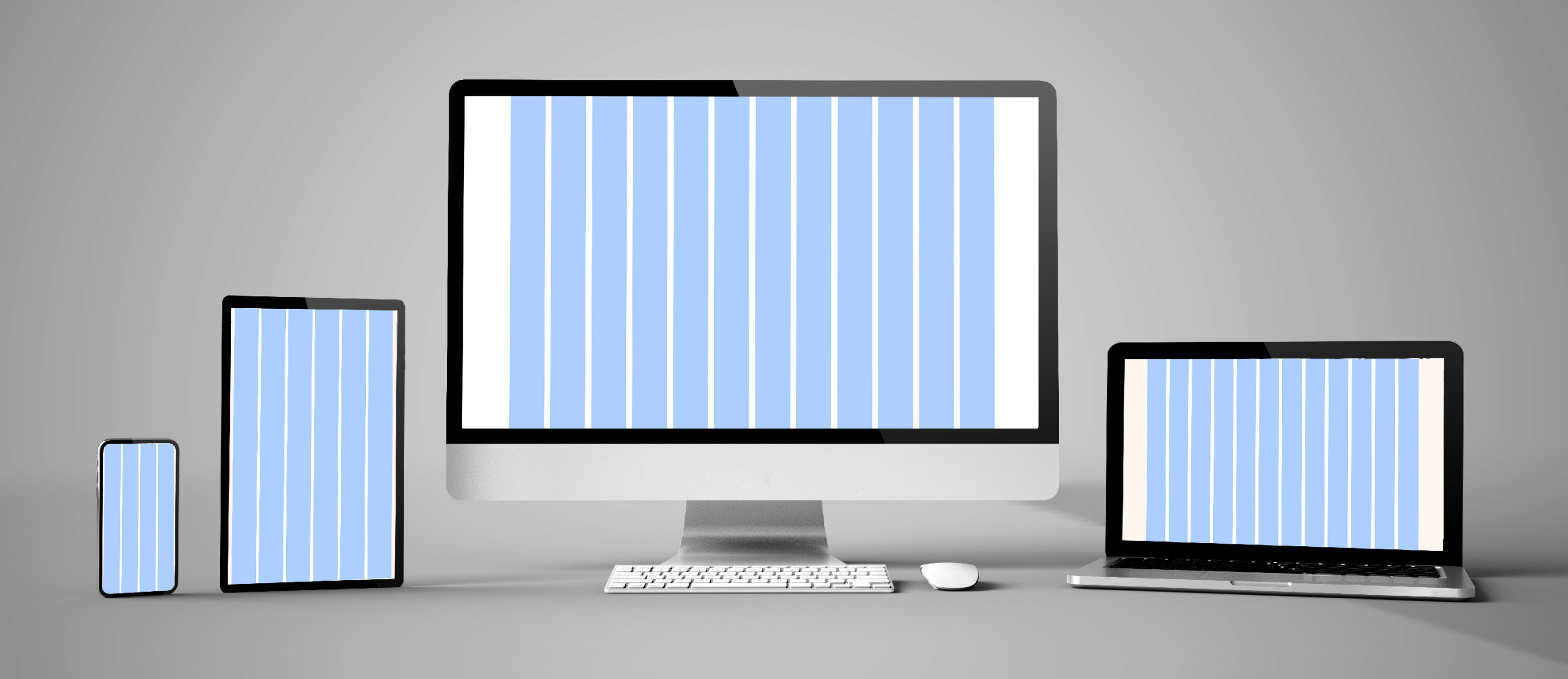
Column system for all screen sizes
ETH website design is based on a flexible grid system that allows layouts to be displayed correctly on all screen sizes.
The grid system is built on a 12-column concept. Tablets in vertical format use six columns; mobile devices use four.??
The grid is centred in the content area and varies depending on the width of the viewport. The maximum width is 1348 pixels, after which point the background elements stretch out to fill the entire width.
Grid definition per breakpoint
Grid definition for mobile: 320¨C480 pixels
Grid definition for tablets or small notebooks (13ˇ±): 768¨C1439 pixels
Grid definition for notebooks (15ˇ±) and desktops: 1440¨C1600 pixels
Uniform spacing between design elements
In order to ensure uniform spacing between elements, the following basic sizes have been defined. These sizes are defined as variables in the frontend.
Fixed spacing
Responsive spacing behaviour
Spacing size increases as the size of the viewport grows. A responsive spacing table defines how spacing elements behave across different breakpoints. The table sets out how much the spacing changes. This means that each component does not have a fixed distance from other components; rather, it changes according to the table and scales to adapt to different devices.
Spacings f¨ąr Mobile: 320 ¨C 767 Pixel
Spacings f¨ąr Tablet und Desktop: 768 ¨C 1600 Pixel
Contact